Projects
Danish Architecture Centre
How might we position a cultural institution as an international gateway to the exploration of a city known for its masterworks of architecture and design?
- zoom
- zoom
- zoom
- zoom
- zoom
- zoom
- zoom
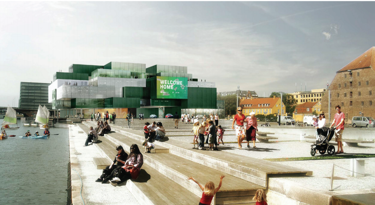
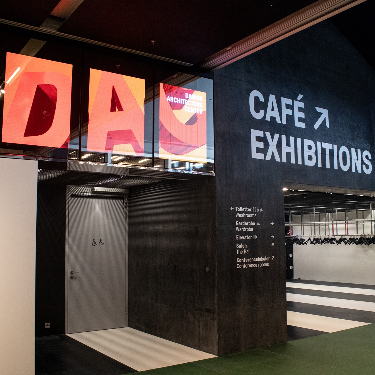
Danish Architecture Centre’s (DAC) decision to relocate to an iconic new building designed by Rem Koolhaas on Copenhagen’s waterfront created an opportunity to rebrand DAC as an international destination for architecture and design and the gateway to cultural exploration of the city. DAC asked MCN to translate its new brand strategy into a powerful creative expression that refl ects DAC’s values and culture, harmonizes with its setting in the distinctive BLOX building and embraces the diversity of DAC’s global audience.
To bring DAC’s new strategy to life, we recommended a full visual identity program and the development of brand guidelines to inform the application of the brand across all audience touch points. We began with an examination of the new brand strategy and positioning and an analysis of the competitive and collaborative landscape for a deeper understanding of the context. From there we crafted insights and explored several approaches. In collaboration with DAC, MCN iterated and refi ned the selected concept.
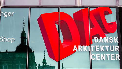
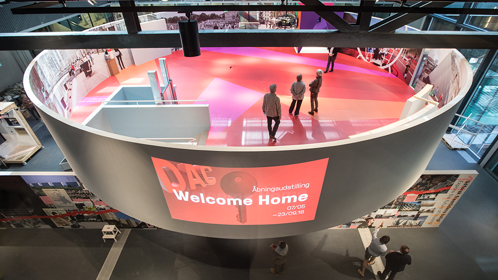
The result was a bold and vibrant brand identity that signals to the world DAC is the welcoming gateway for exploration of Copenhagen, the Architecture City. The new face of DAC evokes the essence of architecture through the use of imagery suggesting the qualities of light and space, volume and form, perspective and scale. We suggested the use of variations in dimension, color and perspective to convey a sense of the multiplicity of forms that defi nes the practice of architecture. We designed the DAC logo to stand out. It is a dynamic, architectural depiction of the DAC name that can be viewed from multiple perspectives. And, like DAC itself, the logo has the latent potential to evolve over time—always new, always inviting, always open. MCN established the brand guidelines to identify elements of the comprehensive brand identity, illustrate applications and inform brand stewards of the optimal arrangement and composition of the elements. The guidelines ensure uniformity and clarity in the use of the brand identity in every context, with a goal of reducing confusion and focusing on growing awareness and driving value back to the primary DAC brand. A secondary brand graphic captures the values and culture of DAC: ever questioning, open and with a touch of liberating, creative chaos. Used In motion formats, the DAC letters break apart and fl oat across city landscapes to takes audiences on virtual tours of the city.
Share: